Our new front page
-
Lunagel

- Mofu~
- Posts: 11240
- Joined: Sat Jan 12, 2008 9:09 am
- Favorite series: Magiranger
- 2nd Favorite Series: Gekiranger
- Location: Japan
Re: Our new front page
New logo's being worked on.


-
qedins
- Go Go!
- Posts: 63
- Joined: Sat Jul 25, 2009 6:10 am
- Favorite series: Kamen Rider Blade
- 2nd Favorite Series: Shinkenger
- Favorite Actor?: Riisa Naka
- Favorite Band: L'arc en Ciel
- Alignment: Lawful Neutral
- Quote: "Where's our eccentric?"
"I'm right here!"
"No. I mean sempai."
"Oh." - Location: Filgaia
Re: Our new front page
too bright
I use glasses, so it hurt my eyes even more
I use glasses, so it hurt my eyes even more
-
kikaida

- IXA
- Posts: 205
- Joined: Sat Nov 14, 2009 10:13 pm
- Favorite series: Kabuto
- 2nd Favorite Series: Blade
Re: Our new front page
How about this . . . I "threw" together a Drupal theme for you . . . check the screenshot

Of course, I borrowed images and I know that TV-Nihon is more than Kamen Rider . . . but that is how I envision it . . .
this i do like
Spoiler
Of course, I borrowed images and I know that TV-Nihon is more than Kamen Rider . . . but that is how I envision it . . .
this i do like
"There is no charge for awesomeness . . . or attractiveness." Po.
-
decade368990
- Train man
- Posts: 725
- Joined: Sun Jun 10, 2012 6:51 am
- Gender: Male
- Favorite series: Kuuga
- 2nd Favorite Series: W
- Dreamy: Osaki Ichika and Kudo Mio
- Quote: Grow a spine, J.A.R.V.I.S. I got a date. -- Tony Stark
- Contact:
Re: Our new front page
The red & black was indeed distracting and it's good that you guys removed it.
For this one, I felt a bit too plain. The previous one looked very professional and very user-friendly. If you want to use the current version, maybe try to use the Gradient tool just like the previous one.
A new logo, as you guys planned, go ahead to make it.
For this one, I felt a bit too plain. The previous one looked very professional and very user-friendly. If you want to use the current version, maybe try to use the Gradient tool just like the previous one.
A new logo, as you guys planned, go ahead to make it.
-
Go-On Macaroni

- Rising to the Top

- Posts: 3111
- Joined: Wed Jul 01, 2009 7:18 pm
- Type: INFP Healer
- Contact:
Re: Our new front page
I wear glasses and I thought it was okay.qedins wrote:too bright
I use glasses, so it hurt my eyes even more
-
takenoko
- Team Baron

- Posts: 36818
- Joined: Mon Dec 10, 2007 8:33 pm
- Gender: Toast
- Favorite series: All of them
- Alignment: Neutral
- My boom: stick
- Quote: <Lunagel> That's Toei's dumb fault
- Type: ISFJ Protector
- Location: Yami ni umare, yami ni kisu
- Contact:
Re: Our new front page
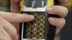
We do a lot of shows, I'd rather not have characters on the front page unless it was on a rotating basis. Symbols or logos are perfect though, so the background is perfect.kikaida wrote:How about this . . . I "threw" together a Drupal theme for you . . . check the screenshot
Spoiler
[ Image ]
Of course, I borrowed images and I know that TV-Nihon is more than Kamen Rider . . . but that is how I envision it . . .
-
TankCoyote
- Hyakkiyakou wo Buttagiru
- Posts: 119
- Joined: Mon Dec 12, 2011 10:04 pm
- Favorite series: Gokaiger
- 2nd Favorite Series: Decade
- Dreamy: Joe
- Favorite Actor?: Gai
- Favorite Band: Yes
- Alignment: Lawful Neutral
- My boom: my GF
- Quote: GOKAICHANGE! GoooookaiSiiiilver!
- Location: GouJyuRex
Re: Our new front page
I agree with you on this oneqedins wrote:too bright
I use glasses, so it hurt my eyes even more

-
takenoko
- Team Baron
- Posts: 36818
- Joined: Mon Dec 10, 2007 8:33 pm
- Gender: Toast
- Favorite series: All of them
- Alignment: Neutral
- My boom: stick
- Quote: <Lunagel> That's Toei's dumb fault
- Type: ISFJ Protector
- Location: Yami ni umare, yami ni kisu
- Contact:
Re: Our new front page

I don't think you guys have a point about it being too bright, since the level of whiteness is the same as before.
What the old front page did have is more dark colors to serve as points of contrast, which is something that we sort of need now.
-
qedins
- Go Go!
- Posts: 63
- Joined: Sat Jul 25, 2009 6:10 am
- Favorite series: Kamen Rider Blade
- 2nd Favorite Series: Shinkenger
- Favorite Actor?: Riisa Naka
- Favorite Band: L'arc en Ciel
- Alignment: Lawful Neutral
- Quote: "Where's our eccentric?"
"I'm right here!"
"No. I mean sempai."
"Oh." - Location: Filgaia
Re: Our new front page
yup, just like you said Take
I just give my impression when i see the new one and that's what first come to mind
I just give my impression when i see the new one and that's what first come to mind
-
TankCoyote
- Hyakkiyakou wo Buttagiru
- Posts: 119
- Joined: Mon Dec 12, 2011 10:04 pm
- Favorite series: Gokaiger
- 2nd Favorite Series: Decade
- Dreamy: Joe
- Favorite Actor?: Gai
- Favorite Band: Yes
- Alignment: Lawful Neutral
- My boom: my GF
- Quote: GOKAICHANGE! GoooookaiSiiiilver!
- Location: GouJyuRex
Re: Our new front page
How about putting something along the margin to make the page more dynamic? even the simple page outline that the old one had is cool
-
Quatrerwin

- [insert witty title here]
- Posts: 276
- Joined: Mon Dec 10, 2007 8:29 pm
- Favorite series: Zeta Gundam
- 2nd Favorite Series: Gundam 0079
- Alignment: Chaotic Neutral
- Quote: "You're dead, this is the afterlife -- and I'm God" - Q
- Location: WI, USA
Re: Our new front page
I was thinking of using a base theme that would allow me to do that easily once the final design comes around. The only problem with dynamic pages is that they're usually implemented with Javascript or AJAX and you don't know who has those turned off and they're a pain for mobile users to use. I think I may have a way around that problem though.TankCoyote wrote:How about putting something along the margin to make the page more dynamic? even the simple page outline that the old one had is cool

Re: Our new front page
As others said, it's too white. And yes, I'm awasre that the old one was white too 
A darker background with white text (exactly as the forum color scheme, but without the red lines) is a lot more relaxing for anyone to read, regardless of color preferences.
About js and ajax...dunno why you would need those since plain good html and style sheets can do that just fine.
A darker background with white text (exactly as the forum color scheme, but without the red lines) is a lot more relaxing for anyone to read, regardless of color preferences.
About js and ajax...dunno why you would need those since plain good html and style sheets can do that just fine.
-
archer9234

- Faiz
- Posts: 698
- Joined: Mon Mar 24, 2008 10:55 am
- Favorite series: Hurricanger
- 2nd Favorite Series: Shinkenger
- Dreamy: Hurricane Blue
- Favorite Actor?: Patrick Stewert
- Favorite Band: Project R
- Alignment: Lawful Neutral
- My boom: Hulk Universe
- Quote: "Don't get us angry. You REALLY don't want to see us angry!" - Hulk & She-Hulk
- Location: Brooklyn, New York
Re: Our new front page
Both new pages suck for me. Too white like everyone else says. And he font was bad on the last one. Keep trying out new designs though. Eventually one will work.
-
Areku The O.F.

- Hyakkiyakou wo Buttagiru
- Posts: 127
- Joined: Sun Sep 12, 2010 7:13 pm
- Favorite series: KR Black
- 2nd Favorite Series: KR Faiz
- Dreamy: Too many to count...
- Favorite Actor?: Tetsuo Kurata
- Favorite Band: Dream Theater
- Alignment: Neutral
- My boom: Toku in general
- Quote: "Gather ye rosebuds while ye may
Old time is still a' flying
And that same flower that smiles you today
Tomorrow will be dying..."
Re: Our new front page
It needs a banner, pronto!!! Also the white overwhelms because of the lack of backgrounds, banners, designs, etc. Also, a sans-serif font wouldn't hurt.
3... 2... 1... Time Out... Deformation.